Think Telic — OnTime Soft, Inc. Independent Pharmacy Network
OnTime Pharmacy
Independent pharmacies in Puerto Rico had no direct line to their patients — no app, no refill requests, no remote option. A three-product system changed that: 50 pharmacies served, six standalone branded apps built on the same architecture.
Focus
Patient app, pharmacy dashboard, master admin system
Ownership
Sole UX/UI Designer, via Think Telic (2017–2020)
Status
Live — 50 pharmacies, 6 spun into standalone apps
Overview
For patients of independent pharmacies across Puerto Rico, managing prescriptions meant either showing up in person or calling. There was no app to request refills, no way to track a prescription’s status, no remote option for caretakers managing medications for an elderly parent or a family member with limited mobility.
This project built the bridge — a patient-facing app, a pharmacy-side dashboard, and a master admin system to manage the network — designed as one connected system from the ground up.
The problem
Independent community pharmacies in Puerto Rico were losing ground. Larger chains and private-insurance networks were offering patients digital tools — app-based refills, prescription tracking, remote management — that community pharmacies simply couldn’t match. OnTime Soft needed a system that could level that playing field for dozens of independent pharmacies at once, without making any of them feel like an afterthought in someone else’s app.
How the workflow works
The patient experience was designed for users 60 and older — every decision prioritized clarity, large typography, and the fewest possible steps.
When a patient opens the app for the first time, they choose their pharmacy, fill in their personal information, and can add a dependent immediately or return to it later. From there, the experience centers on two actions: send a prescription or request a refill. In Puerto Rico, prescriptions are issued on paper — so sending one means opening the camera and photographing the document. Requesting a refill means scanning the barcode on the pill bottle, with a manual number entry fallback for users whose barcode won’t scan. Patients can add notes to either request and, if managing dependents, specify who the prescription is for before sending.
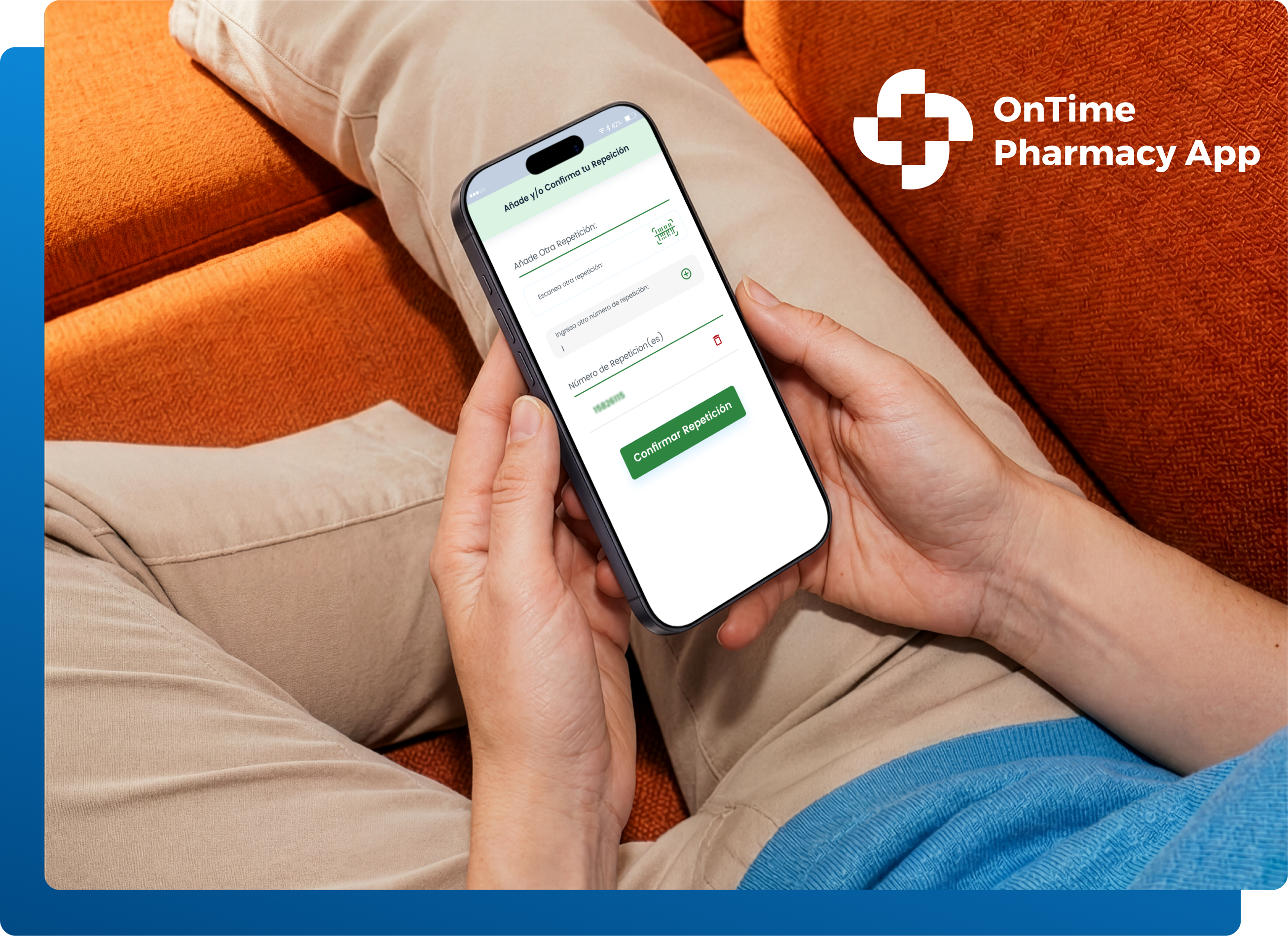
Patient-facing app, designed for simplicity
On the pharmacy side, incoming prescriptions and refill requests appear in the admin dashboard for pharmacists to process. Originally, that meant managing requests entirely within the dashboard. A later update — the result of a business negotiation between OnTime and its pharmacy management system provider — connected the two systems directly, so pharmacists no longer had to switch between them to do their jobs.
My role
As the only UX professional on the project, I ran the research myself: interviews with OnTime’s management team, sessions with pharmacy owners, and stakeholder reviews throughout the build. Patients weren’t directly accessible for research — pharmacy owners, who have daily contact with them, carried that role instead. That work shaped four personas covering the full range of people the system had to serve: the elderly patient managing their own prescriptions, the caretaker managing several dependents at once, the pharmacist, and the pharmacy owner.
I mapped the full information architecture across all user types — patients, pharmacists, pharmacy owners, and OnTime’s admin team — establishing role access and the boundaries between roles before a single screen was designed. User flow diagrams for each product traced every interaction from entry point to resolution. That structural work came first, because with three interconnected products serving four distinct user types, designing without it would have meant building in gaps.
The build ran in two-week sprints over eight months to a year — each cycle an opportunity to test, catch what wasn’t working, and adjust before moving forward.
The design challenge
The project started with a clear scope: one patient-facing app, one pharmacy dashboard, and a master admin to manage pharmacies within the OnTime system. Midway through the build, that scope changed.
Larger pharmacies didn’t want to appear in the OnTime app alongside a competitor. They wanted their own — carrying their name, their brand, their identity. That request wasn’t just a design preference; it was a structural problem. The master admin had been built to manage pharmacies within a shared system. It had no way to handle independent app data — unique branding, separate configurations, pharmacy-specific content — because that need didn’t exist when it was designed.
The answer wasn’t to rebuild from scratch or fork the product into separate codebases. The challenge was extending what already existed to support both models simultaneously: pharmacies that stayed within the OnTime app, and pharmacies that wanted to operate independently. That meant expanding the master admin into something it was never originally meant to be — a system capable of managing not just individual standalone pharmacy apps, but entire pharmacy chains, each with multiple locations, their own downstream experience, and their own branded app to maintain.
Approach
Patient app first. I started with the patient app because that’s what the client and the pharmacies actually cared about — the experience patients and caretakers would judge them by, not the back-office process. Once that was solid, I moved on to the pharmacy dashboard pharmacies would use to manage prescriptions and refills day to day.
A master admin that had to grow. The master admin system came later, and it evolved out of necessity. It started as a simple way to manage individual pharmacies inside the OnTime app. But once larger pharmacies began asking for their own standalone, branded apps instead of sharing a list with everyone else, the master admin had to grow into something that could manage both individual pharmacies and entire pharmacy chains — each with their own downstream app.
Design Decisions
Designed the app around the people actually holding the phone. Large typography, an uncluttered layout, and a deliberately simple color scheme — built for elderly patients and the caretakers helping them. The two primary actions, send a prescription and request a refill, are the only things on the home screen. Camera is the primary input method: photograph a paper prescription or scan a barcode on a pill bottle. No typing required for the core task. A manual number entry fallback handles cases where a barcode won’t scan. Caretakers can manage multiple dependents from a single account — children, elderly parents, family members with limited mobility — and specify who each prescription is for before sending.
Designed the dashboard around pharmacists' time, not pharmacy owners' oversight. Pharmacy owners were clear that a new tool couldn’t mean more work for their staff. The pharmacy dashboard let pharmacists process more prescriptions with less direct back-and-forth — patient notes attached to each prescription, status updates paired with automatic text alerts to patients, and the ability for pharmacists working across multiple locations to switch between pharmacies without logging in and out.
Built role-based permissions around how pharmacies actually operate. Owners could see everything. Managers supervised pharmacists. Pharmacists saw only active prescriptions and incoming refills. A fourth role — the reader — gave pharmacy assistants visibility into the prescription queue without the ability to process them, respecting the licensing boundaries that governed their work. Every action was logged to an auditable trail, exportable for HIPAA compliance reviews.
Designed the master admin to earn trust at scale. As the system grew to manage dozens of pharmacies — including RX30 pharmacy chains — the admin needed to give OnTime’s team a clear, trustworthy view of the whole network: which pharmacies were verified and authentic, usage patterns by demographic and platform, and oversight tools that scaled with the number of pharmacies joining the system.
Solved for pharmacy branding without forking the product. When bigger pharmacies pushed to break away from the shared app and have their own — carrying their own name and brand — the answer wasn’t to rebuild the product for each one. I defined one consistent core UX pattern, then built a scalable palette and theming system on top of it, so each pharmacy could carry its own brand identity without duplicating the underlying design or interaction model. That system is still what makes it possible to onboard a new standalone pharmacy app today.
Outcome
Today, the OnTime Pharmacy App connects 50 independent pharmacies across Puerto Rico to more than 5,000 active patients.
What started with two pharmacies has grown steadily — six now operate their own standalone branded apps, with a seventh in progress.
The clearest external validation came from OnTime Soft itself — they returned for a second engagement, roughly three months, specifically to build out that model. They came back to extend what was built, not to repair it.
The engagement also included an app identity system, a corporate website redesign, and a patient-facing landing page — work that extended the project beyond the product itself.
© 2026 Zoraida Salcedo
Terms of Use & Privacy Policy